Looking for my latest offerings and posts about nature journaling?
Go to my brand new website! I have a section dedicated to all my nature journaling offerings.
 | ||
click image to enlargeVery often I get questions about how I design the layout of my nature journal pages.People want to know how I:
The most frequent question is "Do you plan the layout first? "
The answer is No. Like so much of nature journaling, everything happens organically in response to what's happening out there in living, breathing, moving, changing nature.
The next question usually is "Do you do all of the graphic elements (borders, lettering etc.) in the field or later on at home?"
The answer is Both.
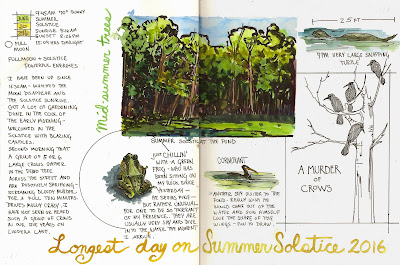
Using the journal entry above I'm going to walk you through the whole process of how this page evolved.
It began in the early morning with a group of crows causing an enormous racket for the second day in a row. This was something new that I had not experienced on our street before. The day before I just heard them and didn't see them, and they were so loud and crazy sounding I was puzzled, and even unsure they actually were crows. The next day, the day of this journal entry, they were back and I watched them and listened to their racket for several minutes before they flew off. I had decided not to sketch them in favor of just observing something that was an unusual experience and new to me.
I headed out to my bench by the pond and entered my basic data for the day, date, time weather etc. and did a small landscape of the environment, and wrote just a line underneath. That's the image below.
Step 2
After establishing the scene I observed and sketched a green frog.
This little guy had been hanging around my bench for several days and I sketched him each time I had an opportunity.
I also wrote about him, right then on the spot.
With the center of the sketchbook running right through the center of the landscape it seemed like a good idea to place the frog to one side of the page break.
Step 3
My next sketching opportunity came when the cormorant arrived.
I observed and sketched and wrote, all right at that moment. Placing this sketch to the right of the page break created a sense of symmetry.
That decision was made consciously, but in a fleeting moment, I didn't really spend any time at all thinking about it. Two small sketches beneath a larger rectangle seemed the logical thing to do.
Step 4
Later on in the evening I went out to the pond again and caught a glimpse of a very large snapping turtle. I sketched her and made the size notation and wrote a brief description.
I also took a few moments to stand in front of the tree the crows were in to draw that and then added the crows from memory. On the spot, I added the caption A Murder of Crows. . The term "murder" has been used to describe a flock of crows as far back as the 15th century, according to the Oxford English Dictionary.
So what you see above is basically the page spread naked, just what was done in the field without any embellishments.
Step 5
Later on inside I evaluated the pages.
Clearly I needed to fill up the large space on the left. It was too late in the evening for any more sketching to be done outside so that's where I decided to spend a few moments writing a reflection on the days events.
I write in block printing to be able to create a fairly even block of text.
Step 6
The sketches are feeling like they're just floating on the page, so I decide to anchor the two I like best with a border. I choose a circle for the frog and a rectangle with lines that extend at the corners for the crows.
Step 7
There's too much white space to the left of the landscape, and also too much white space at the bottom of the pages. Those are both good places for some hand lettering, done with a brush. It's fun to turn the sketchbook and write with larger hand lettering so that the text ends up being a vertical element, as I did with the words Mid-summer Trees.
This is the most common way my nature journal pages develop. Sketching and some writing done on the spot and a bit of dressing up later on. So much is done intuitively. I am always trying to find a way to bring the page together as a cohesive whole. I want each element on the page to be in relationship to the others and connected in some way. That's why I chose to have the circle and the border around the crows connect to the landscape sketch. The measurement line above the snapping turtle relates to the linear border around the crows, and the cormorant sketch is firmly locked between the frog and crows. The principles involved here are
If you keep those in mind you will create beautiful nature journal pages that are pleasing and visually organized.
Free mini class sign up HERE |
Saturday, July 9, 2016
7 Steps to Creating a Nature Journal Page Layout
Subscribe to:
Post Comments (Atom)


Beautiful Jan
ReplyDeleteI love seeing the way your page developed. Thank you for sharing!
ReplyDeletehi Tonya, It's a 9x12 Stillman & Birn Zeta sketchbook. One of my favs.
ReplyDelete