Showing posts with label watercolor. Show all posts

Tuesday, September 29, 2015

Durham Fair Sketches 2015


click image to enlarge

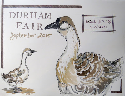
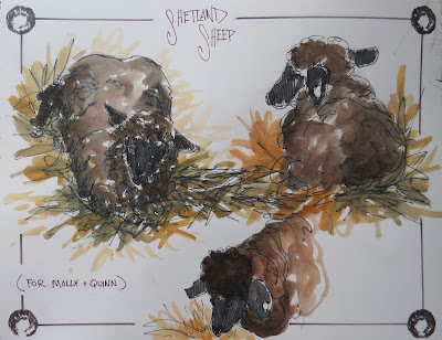
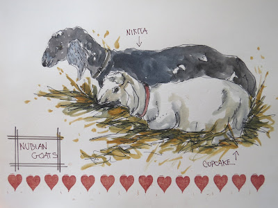
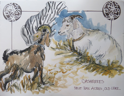
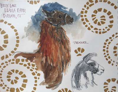
It is now officially fall, now that the Durham Fair is over. This wonderful agricultural fair, the largest in Connecticut always ushers in the autumn for me.


I've gone to the fair many, many times in my twenty-seven years living in Connecticut. However, this is only the second year that I have sketched at the fair. Children and sketching at the fair don't really mix well. but now my children are all grown and I can take an entire day to enjoy the fair through my pens and paints. 


click image to enlarge
A big sketching outing like the fair takes some preparation to make the day really successful, I like to arrive early when the gates open on Friday to avoid the large Saturday crowds. Friday is the day for school field trips to the fair, and I think it's good for kids to see someone sketching in public.

click image to enlarge
Wear the right clothing and shoes. I stand to sketch at the fair and our fair is on very hilly terrain so a good pair of light hikers is a must for me.  ( also Advil before I leave so my back is not totally screaming half way through the day) Light weight sweater which I can roll up and stuff in my sketch bag, and vest with lots of pockets to stash pens, brushes watercolors etc. for easy access while I'm sketching. I clean out my sketch bag and travel with a minimum of carefully chosen supplies.

click image to enlarge
I've learned over the years that a big "in public" day of sketching is not the time for me to be experimenting with new stuff. That said I ordered a totally new sketchbook to use at the fair, one I've never used before. I had every intention of testing it out first but I was just too busy with other projects so I went in to this not knowing how the paper would be.  Fortunately, the paper was fine, not outstanding, but fine. Although it's 140 lb. hot press paper, I was surprised that it buckled a bit, not enough to be very concerned about and it flattened after drying I was just surprised and didn;t expect that to happen.  In case you're wondering the sketchbook was The American Journey Journaling Sketchbook from CheapJoes, see it HERE


click image to enlarge

The journal is 9x12 and one of my intentions for the fair was to work large. I've been working in small sketchbooks since the beginning of the year and I really felt it was time for a change. I'm glad I did , as working large at the fair was very freeing and I think contributed to the bold character of the sketches. I also decided from the get go that the sketches would be large two, possibly only one per page. I didn't want to cram the pages with lots of little sketches, because then I might as well be working in a small sketchbook. So it felt really good to spread out and draw large, 

click image to enlarge

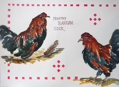
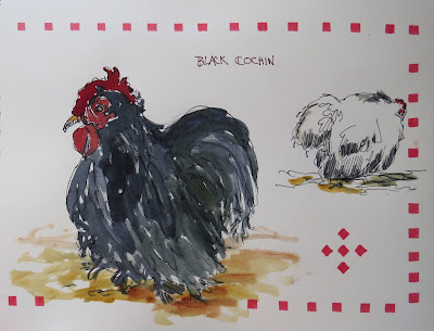
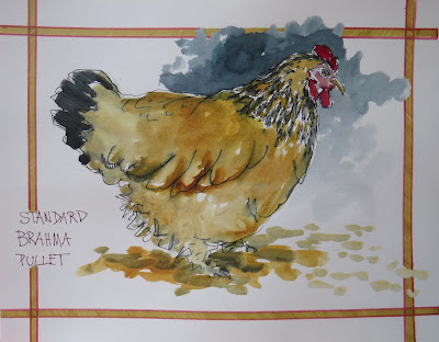
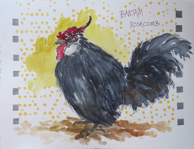
My usual method for sketching at big events like this is to start with a loose, quick light pencil sketch, just to get my bearings on the page and get the basic shape and gesture of the animal. then I switch to a Tradio Stylo pen. This is not a waterproof pen and I use it for exactly that reason. I can very quickly get tonal washes, areas of shadow, and deep ink blacks as well as interesting fluid inky areas n my sketches. The black ink also mixes with the watercolors toning down things a bit which is perfect for earth, natural subjects like farm animals. That ink mixing in with the colors in every sketch also brings a consistency to the look of each page of sketches from the fair, so they work as a whole series of related images.

click image to enlarge
Using non-waterproof pen also reminds me to only use minimal washes and not get caught up trying to do complex many layered paintings, and it reminds me to leave bits of white for sparkle. When sketching at the fair I always try and remember that less is more.

click image to enlarge
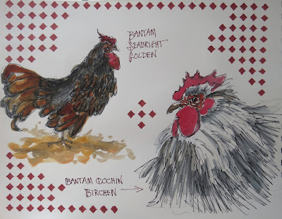
I took along my QoR watercolor set, and a brown Sharpie ultra fine point to write in the animals names, breeds, farms and any other information I could gather.

click image to enlarge
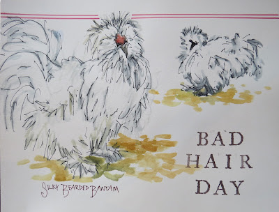
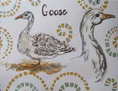
During the rest of the weekend at home in the studio I added the borders, backgrounds and the stamped lettering.

click image to enlarge

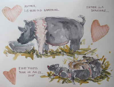
All in All after sketching for 6 hours I had filled eighteen pages with thirty sketches!

click image to enlarge
Keep scrolling down to see all the rest of the pages.

click image to enlarge

click image to enlarge

click image to enlarge

click image to enlarge

click image to enlarge

click image to enlarge

click image to enlarge

Tuesday, March 31, 2015

Sketching on Retreat


click image to enlarge

Yes, we are still getting snow. and it was actually lovely on Saturday when I was on retreat enjoying a weekend of rest, spiritual renewal and enriching ideas.

click image to enlarge

I have a special sketchbook for retreats I began it back in 2010 but abandoned it because I found the paper so challenging.  The sketchbook is a Punjab watercolor journal.  The paper is hand made, very textured and really sucks the paint in as soon as it hits the surface.

click image to enlarge
For a number of years I journaled and sketched my retreats in whatever sketchbook I happened to be working in at the time. I don't regret that , generally I like things integrated. But the lovely handmade paper in the Punjab with its irregular pages and soft fraying edges is so beautiful that five years later I decided I was ready to give it another try. Last month when I went on retreat to begin Lent. 

click image to enlarge
Five years of experience using pens and watercolors and sampling many different kinds of papers gave me the knowledge I needed to make this paper work for me. The other reason I abandoned the journal was because I had tried some lettering and done some cutsie drawings on the inside cover which were not at all to my liking. But even that turned out fine since it prompted me to buy some books on hand lettering to improve the quality of my lettering skills. The custie drawings remain but that was a lesson in really thinking through what you want on the inside cover of your sketchbook before you dive in.

click image to enlarge.
click image to enlarge

click  image to enlarge


Tomorrow begins International Fake Journal Month which I will be participating in for the first time, Here in the main posting area, and on the page you can access at the top of the blog using the tab marked Int'l fake Journal Month you can follow along. That's the only thing I'll be posting for April, everything else I'll be sharing on my Facebook sketching page  at The Sketchbook Hypothesis . I hope you'll enjoy following along.  You can read all about what I'm planning and meet my persona by clicking the Int'l Fake Journal Month tab at the top of the page.


Monday, March 23, 2015

Nature Sketching Class

Click image to enlarge

 I can't even begin to tell you how many sketches I've done and not posted here. Whole sketchbooks full actually!  I find it so hard to keep up with posting to sketching groups I belong to on Facebook etc. and to post here. Truth is, I'd rather be sketching!

Yesterday, I taught a nature sketching class in my studio, had seven wonderful students and lots of fun. The sketch above was our Mad Hatter's Tea Party warm up.

Click image to enlarge
I had a long table set up with various natural objects set out. Everyone took a seat and we set the timer for 15 minutes. We sketched and when the timer went off we all shifted , and took the seat to out left and sketched the next object.  Fun and a great way to loosen up and improve your sketching speed.

Click image to enlarge


This was my demo of a contour line drawing,  using a Platinum Carbon fountain pen and QoR watercolors.  Blue gouache background, washi tape added, along with a quote from a reading we discussed at the beginning of the class from Sarah Gillespie's blog.

April is International Fake Journal Month (IFJM) and I'll be participating and posting my fake journal here, so be on the look out for a consistent month's worth of fake journal posts, created by a fake person, (naturally), named Mavis Mabb.  You can find out all about IFJM HERE

Saturday, January 3, 2015

Sketching Squirrel

Click image to enlarge
You see them everyday. They're funny, annoying, and they're everywhere. One of my New Year's rituals is to be aware of the first animal I see on New Year's Day, (other than my pets) and take that animal as my totem, or guide animal for the year.

This year it was a common gray squirrel. I was frankly a little disappointed.  Other year's I've seen a red tailed hawk, a black horse, a white tailed deer, but this year just a squirrel.

Then  I do what I always do, and that is look up the symbolic meaning of the animal and boy did I get a surprise! The squirrel is a power animal, with many, many lesson to teach us!

I will have much to think about and learn from this year with Squirrel as my guide. You can read about Squirrels symbolic meaning HERE.

My new sketchbook to start 2015 is a Stillman & Birn, 5.5 x 8.5 Zeta, with beautiful smooth, heavy weight, mixed media paper. It's such a great sketchbook to work in because it really does handle all media. It's not the same as good watercolor paper, but it does take watercolors remarkably well.Plus its smooth surface is beautiful for all kinds of pens and markers. My new favorite watercolors (and maybe my all time favorite from now on) are the new QoR watercolors from Golden.  I like them for their radiant, clarity and juicy pigment saturation. They also have an excellent "flow". I'm not really sure how else to describe that but the paints move and flow in such a beautiful way on  practically every surface I've used them on.

My new pen of choice (and again I *might* have found the ONE) is a Platinum Carbon fountain pen, using Platinum Carbon ink.  This is not an expensive pen. I think I paid $12 for it, bought the converter ($10) so I can fill it from an ink bottle and not have to buy expensive cartridges, and bought a bottle of carbon ink ($20).

I m so surprised at this pen's versatility. It's really quite elegant, especially so for a $12 pen!  The body is long and tapered, similar to a paint brush, which allows yo to hold it further back and loosely which helps loosen up your mark making and allows for lots of expressive qualities.  The nib, is also very responsive (though not a flex nib it actually has a lot of movement to it) and you can turn the pen over and draw easily with the other side of the nib for very thin lines.

The carbon ink is very waterproof and dries very quickly a big plus when you want to put watercolors over your ink work. The only thing I don't like is the plastic cap which does not post the the end of the pen. I always have to be sure I don't drop it and lose it. Other than that I'm really loving this pen!


Tuesday, December 23, 2014

Delving in to the Sosltice: sketches about the dark

click image to enlarge
 During these short dark days every moment of sunlight is a miracle. The rising and setting of the sun become major events for me as they were for my distant ancestors across the seas of thousands of years.  Yet, despite the fascination with the precious little sunlight we get here in the northern hemisphere this time of year it is the ever encroaching darkness that really takes center stage in my mind and imagination.

Dark shades of blue, purple, black and brown dominate my sketches.  The light (always impossible to really capture) is symbolically portrayed through the hot fiery colors of the sunrise and sunset,  Inevitably metallic gold and glitter gel pens, as well a bronze, white and silver pens make their appearance in my sketchbooks at this time of year,
click on the image to enlarge


Another thing I do this time of year is work more and more with  water soluble ink in my pens. When watercolors are added the ink flows and mixes into the colors deepening them and harmonizing them in a dark, inky sort of way. Knowing that my ink line will bleed and run if touched with water also makes me leave more bits of sparkling white paper as I endeavor to keep lines intact in certain parts of the sketch. These sprinkles of white add to the contrast in the sketch and make the dark seem even darker.
click image to enlarge

A dusting of snow gave me an opportunity to leave a lot of white paper and very quickly create a bold, wintry scene on solstice day.


click image to enlarge

By late in the day all the snow was gone and we were back to deep earthy colors made even more vibrant and rich because everything was wet from the recently melted snow.

click image to enlarge

One more way to capture the season is to create an art journal page. not a sketch, but rather a mixed media piece of art that is contained on a page in my sketchbook.

So many wonderful ways to create and record what we see, and experience everyday. Each sketch is a small celebration of all the good things that surround me each and every day.

Thursday, October 16, 2014

More #INKtober


Click on image to enlarge


#INKtober continues along and I continue to learn about myself, my sketching preferences and my materials.  Above Pilot falcon flex nib fountain pen and a light watercolor wash.


Click  image to enlarge

This one made with a Pentel Tradio, which has water-soluble ink and a Kuretake brush writer in medium brown.  This was a bold and interesting combination.


Click image to enlarge
And back to Pilot Falcon flex nib fountain pen and Liquitex acrylic markers for the Northern Flicker and the Pentel Pocket Brush Pen and Liquitex acrylic markers for the Red Winged Blackbird. 

One of the things I am seeing confirmed over and over again for me is that I like to switch tools and materials A LOT. The choices are driven both by the subject and by the result I want to achieve. I also think my mood also dictates what I want to sketch which then drives the choice of tools and materials. 

I think it's really exciting to have so many options at my disposal, and I keep reminding myself that keeping a sketchbook is about me, enjoying my art!  

Wednesday, October 1, 2014

INKtober

31 Days 31 Drawings


Click on image to enlarge


INKtober is a month long sketching challenge started by Jake Parker back in 2009, as a way to improve his inking skills and develop a positive drawing habit. 

It's grown into a worldwide initiative with thousands of artists taking up the challenge. 

It's super simple just do a drawing a day in ink. I literally just found out about this today and so before the day was over, and I fell behind at the start I did a quick, quick sketch. 

I'm hoping to use this challenge to improve my skills with the Pilot Pocket Brush Pen. This is a pen that has so many great possibilities.  It creates a bold, expressive line yet is also capable, if handled correctly, to produce very fine lines. It has a true brush tip made of individual hairs and light-fast, permanent black ink. 

It has a definite "look" to it.  I can't decide if I want that "look" to be "my" look, but I keep coming back to this pen so I guess there is something about it that I find fascinating. 

I'm working in a Moleskine sketchbook, because it has smooth paper, great for ink, and because I had one I started back in January of 2012 to use on a trip to the Clark Institute of Art. So the first few pages have some quick thumbnails and larger sketches, copies of masterworks but the rest of the book is blank. so, waste not, want not, might as well use up a sketchbook that's on hand, rather than get a new one. Plus there wasn't time.

The Moleskine has cream colored pages which don'[t seem to scan true to color so I've had to  fiddle with the scan in Photoshop.  Not really exact but the best I could manage.

If you decide to participate use the hashtag #INKtober then when you click on it you can see what thousands of other artists are doing for INKtober! Ah, the fun of social media. 

Besides INKtober I've been doing more nature sketching and have two entries I'd like to share from yesterday. 

Click on image to enlarge
 One Great Egret, one post, three views.  Pilot Varsity fountain pen, black and QoR watercolors. 
Click on image to enlarge

Same materials as above, and a family of swans. I was thrilled to see that the cygnets from the spring have made it to adolescence, and that mom and dad still stay close to them. 

The more I sketch live, moving animals the better I get at it.  Same as with everything in life, practice.   It's hard at first because I can guarantee that your sketches will be pretty wonky, but the more you do it, the more you train you eye and hand to work together and you sharpen your visual memory, the easier it gets to capture the animals form and gesture. And that's what I'm really interested in, the essence. If I keep practicing I think perhaps occasionally I'll also be able to get some defining particulars down too and that will be wonderful. 

Meanwhile I'll take every chance I get to sketch animals from life, something I deeply enjoy. 


Sunday, September 28, 2014

Sketching the Durham Fair

I've been waiting for weeks for Connecticut's largest agricultural fair, the Durham Fair. I've been to the fair a zillion times but this is the first time I've ever sketched the fair.

I was so inspired by Roz Stendahl, who for several years has organized sketch outs at the Minnesota State Fair that I could hardly wait for the Durham Fair.  I prepared for the day by making a few sketching trips to the zoo and by sketching from photos of animals from past years at the fair. 


Sketching the Durham Fair

I packed very light, a couple of pens Pentel Stylo (which ran out after the first sketch!) so I switched to a Pilot Varsity fountain pen (black). Both those pens have the advantage of having water soluble ink which allows me to create tonal washes very quickly with a water brush, ( I brought three of those with me).

Click image to enlarge
I also brought a Uni Kuru Toga .05 mechanical pencil.  When I'm sketching live animals I like to start with a quick pencil sketch before moving to ink. That way I can easily make corrections in proportions or erase if I start and the critter  moves and doesn't look like he'll be returning to that position any time soon.

Click image to enlarge
I usually don't bother to erase and just leave the pencil lines as part of the sketch. One of the things I was looking for at the fair were animals with interesting markings and animals that were in interesting poses or had interesting shapes.

I immediately loved the black spattered edges of the American Lineback, not to mention the Mohawk like mane along her backbone. This is a beautiful American heritage breed I learned from her owner.

The next two, Ayrshires were snuggled so close they looked like one big two headed cow!

Click image to enlarge

On to the chickens! Here I was definitely looking for great colors and interesting shapes.

Click image to enlarge


This handsome guy was very aware that I was admiring him, he kept fluffing his feathers and preening while I was sketching him.  His owner, also the owner of the Quail above was so happy that I chose his birds to sketch. That was one of the really great parts of the day, how excited the owners were that I chose their animals to sketch,


Click image to enlarge


Three types of sweet, gentle goats.  The Nubian with the long basset hound like ears gave me fits. Goats have bony, angular shaped heads and a straight on view was difficult, not to mention that this is a composite of two similar goats since neither one would stand still long enough for me to really get a likeness.  I went back a couple of times to look at them and re-work a bit, finally adding a white gel pen to help define the face.

Click image to enlarge

I love llamas, and I've seen this particular llama at the fair for many years. I've had the opportunity to sketch llamas and their cousins alpacas, a number of times and I finally think I have a handle on their shape and structure.  This lovely white one gave me an opportunity to go in with a nice dark background to make him pop off the page.  I should mention here that I'm using Golden QoR watercolors, in a Hand-Book Journal Co. 7x10 Fluid Watercolor paper journal, spiral bound.

Click image to enlarge

I like chickens a lot so after lunch (hot buttered lobster roll and chocolate cannoli) I went back to the poultry barn. These modern cockerels were just too terrific standing on on long leg, to pass up. I loved the shape they made.

Click on image to enlarge

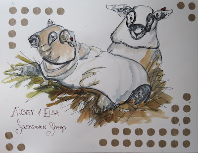
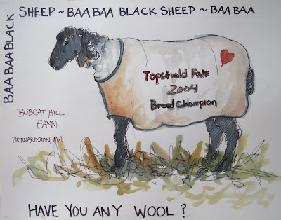
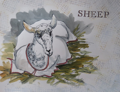
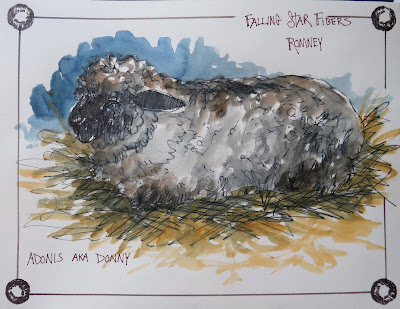
Sheep, just so sweet.  Again, looking for great animals shapes, I was immediately drawn to the Shropshire with his neck stretched out eating hay. I always think the sheep look like they're dressed up for Halloween as super heroes when they wear their coverlets, and that's one thing I knew I wanted to sketch at the fair.

Click on image to enlarge
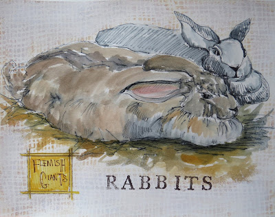
Last but certainly not least, the Belgian Hare. Big ears, fierce face and long body stretched out made a fine subject.  I owned rabbits for many, many years, with my last bunny passing at 15 years old, a year ago in  May.  I love rabbits and think the  hares  have a more wild and fierce look than most of the cuddly cute domestic rabbits, and because of that are fascinating to draw.

I was at the fair for 5 1/2 hours and stood while sketching.  I did remember to take breaks and walk around a bit. Bought some lovely goat's milk soap, and wandered through part of the craft fair tent. Still my back complained that night and for the next two days it was ice packs and Advil. BUT...totally worth it! This was one of the most fun sketching days I've ever had!  I'd do it again next year, and plan to.